The Making of the In-Game Art
Hello
I'm Laras, the artist of "Master of Tiles". In this devlog I'll talk about my preparation, my design decisions, and the end product of the character and all other things I made for this game. This will be a bit lengthy as I plan to talk a bit detailed about stuff, so take the tea (or coffee), sit back, and enjoy!
A Little Bit About Me
I never joined Ludum Dare, and every game jam I clicked "Join" on their page never had any submission from me. It was very hard to finish things, and even my first finished complete sprite sheet was only published last month. But pixel art has always been something for me. I used to recolor Pokemon sprites on paint(!) and make little sprites too, years before I knew that it was some kind of art. I only did them because they were easy to make with the mouse and didn't know that graphic tablets were a thing. And after years not touching them I came back to this kind of visuals last year when I made sprites for a game that I have to hold for now (because it's too big, sadly). I never thought I got addicted to making this kind of graphics in the long run!

The Preparation
After I teamed up with the others (which is about 2-3 days before the jam starts, if I recall), I decided to experiment with different art styles. We wanted to use limited colors, something I had never done before. I tried using 4 hues, and assign 4 shades to each. But apparently it didn't turn out well... After some feedbacks I decided to try out making things in 3 shades. And it turned out so much better than with 16 colors! So we decided to take a monochromatic approach.
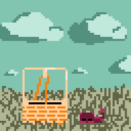 | 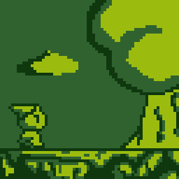 |
Planning
I don't like doing something head-on. Although I tend to do it, my more organized self always prefers planning out things right before doing the actual thing. So after the theme was decided I went to work and made some concept art of the character, according to the ideas we discussed before.

The guitar gun one was inspired by Sonic Underground, and the character itself is based on something I loved to make back in my school days. I thought it's simple enough to make but also appealing enough that people may like it. But naked is boring, so I also made a sketch with it having bard clothes. The others liked the character, so I went on making the pixel art straight on. Oh, and don't mind the slime, it is just chilling. I made it as the enemy concept art, but we decided to not include enemies for now.
Pixel Art of the Character
Walking Animations
First thing I did was making still images of each side of the character. Sadly I have overwritten them, hehe. After that I added the rough movements and added frames to smoothen the animation. At first, only the hands and legs were moving, but then I decided to also move the head a little bit. Here are some of the final results.
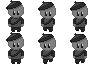 |  |
Idle Animations
After the walking animations comes the idle animation. It is the trickiest one as I like to exaggerate movements. I based off the movements from the idle animations from Paper Mario where the characters rock on their feet. And when you rock on your feet I assume that you also swing your arms a bit. At least I do that, hehe... Here are some variations I made. Which one do you like? On of these two or the one in-game?
 |  |
Waving Animation
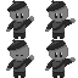
After I'm basically done with everything, I worked on the menu. It was decided that the character should be waving around in the main menu, so I made the animation. It was quite challenging making the waving arms, but I managed it! One thing I learned was that in pixel art, every pixel matters. One pixel too much it will get odd and if one pixel is not there it can make the character seem oddly skinny. I've overwritten the original gif, but here is the waving one.
The Tiles
The tile that you can activate in-game was also made by me. With lots of trial and errors. Sadly I didn't record my process but I didn't know what I was doing, finished a pattern just to decide that I wanted to erase it. But after a while I decided that the floor would need bolts and lamps. At first the blinking effect was only a square outline, and it wasn't really obvious enough. Then we decided to fill the square so that the blinking would be more visible.
I also made other tiles that are not used for now. Following the same process more or less, because I haven't made the habit to sketch before doing when it comes to floors.


I think that's all...
Maybe I will update this devlog when I find some other things I think is worth sharing. Hope you enjoy the game as I enjoyed making the pixel art for it!
Master of Tiles
Solve room puzzles by paying attention to the tunes.
More posts
- The writhing of the codeOct 06, 2020
Leave a comment
Log in with itch.io to leave a comment.